Homepage Experience for the Spectrum Platform

Transforming JPMorgan Asset Management's Spectrum Home into a Personalised, Role-Driven Platform

Role

Role

Lead Product Designer

Duration

Duration

6 Months

Collaborations

Collaborations

Developers, Product Owners, User Researcher

Company

Company

JPMorgan Asset Management

🌐 Overview

I led the end-to-end UX redesign of Spectrum Home, JPMorgan Asset Management’s internal homepage used by over 4,000 global employees to access 120+ internal applications. Despite its strategic role, the homepage was outdated and underused.

My mission: turn it into a personalised, role-based launchpad that users would actually want to use.
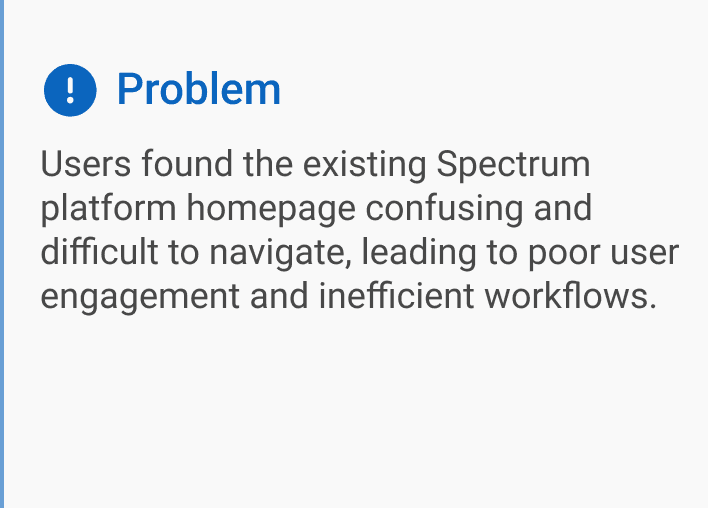
⛔ The Problem

Spectrum serves 120+ internal applications but had a homepage cluttered with irrelevant information, poor discoverability, and lacked role-specific personalisation. Feedback indicated significant user frustration, highlighting the need for a complete UX overhaul.

“I only open Spectrum Home when I have to. Searching for my tools feels like finding a needle in a haystack.”

Portfolio Manager

🧩 The Challenge

Spectrum Home is meant to be the central launchpad for more than 120 internal apps spanning investment, operations, compliance, and sales. Instead, the homepage had drifted into something closer to an un‑loved intranet noticeboard: static, noisy, and easy to ignore.

What greeted users every morning:

  • One‑size‑fits‑all approach that never changed with role or region

  • A labyrinth of identical panels and cryptic acronyms

  • Critical updates scattered across apps instead of surfaced in Home

  • Teams relying on the toolbar menu, or abandoning the page altogether

Consequences we could measure:

  • 26 % of apps were never launched through Spectrum

  • Tooling requests were duplicating dev work, costing approx. $200k/yr

🔍 Research & Discovery

To ground decisions in reality, we ran:

  • 15 stakeholder interviews

  • 8 contextual inquiries

  • Cross‑functional alignment workshop to align goals, success metrics, and prioritise sprint scope

  • Survey (N = 112)

  • Clickstream analysis via Pendo + heuristic review

Key insights:

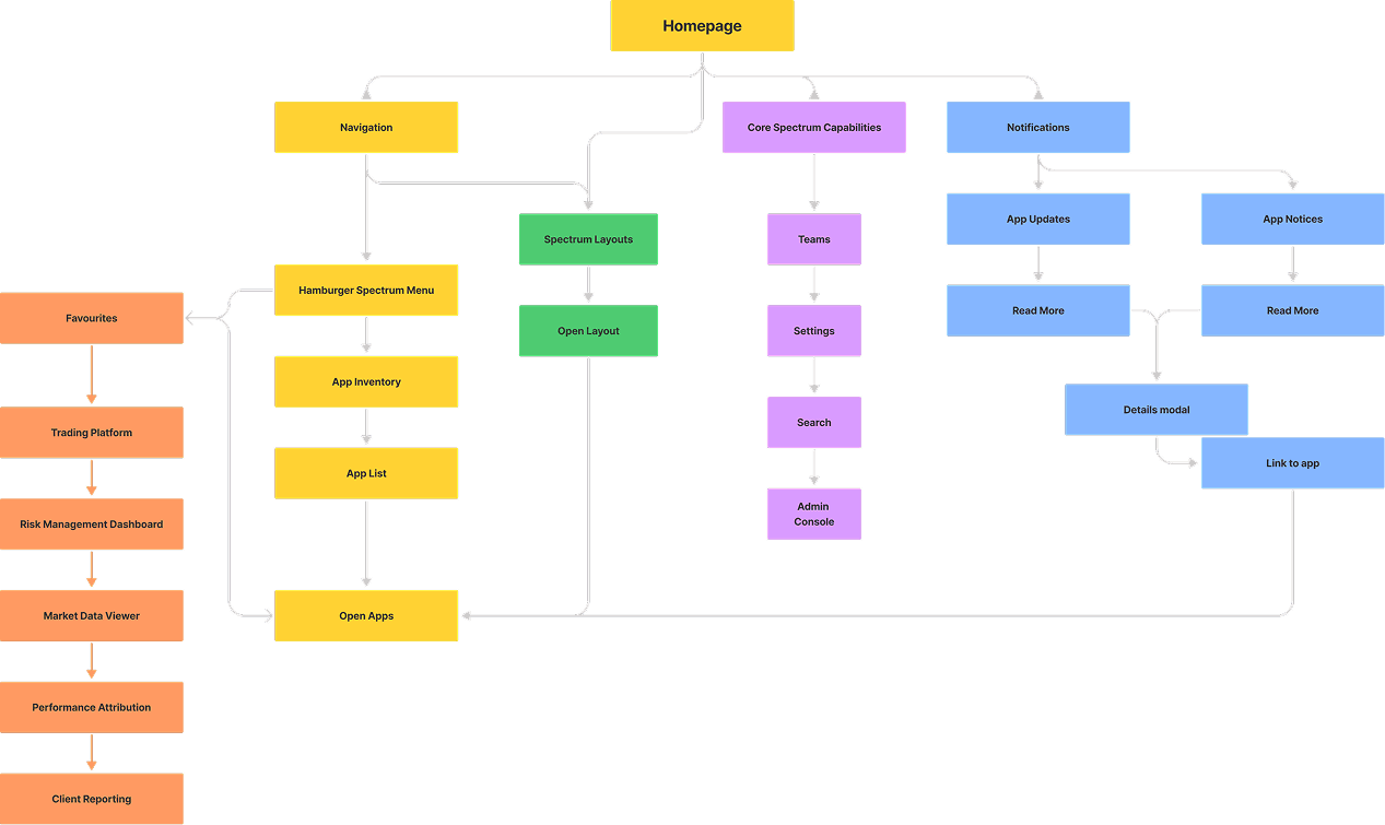
🧠 UX Strategy & IA Redesign

Core principles:

  1. Surface what matters most: Top apps, updates, and role‑relevant content

  2. Declutter the interface: Visual hierarchy and content modularity

  3. Rebuild trust: Make Spectrum Home the daily default

By focusing on

Streamlined Navigation: Simplified menus and improved search functions for easy access to critical tools.
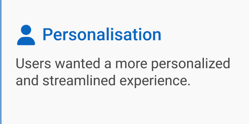
Role-Specific Personalization: Displaying relevant information based on user roles, ensuring that each user sees apps and updates aligned with their daily tasks.

Centralized Update Hub: Consolidating updates, announcements, and critical notifications in one place.

After initial testing with stakeholders, high-fidelity prototypes were created and refined based on their feedback.
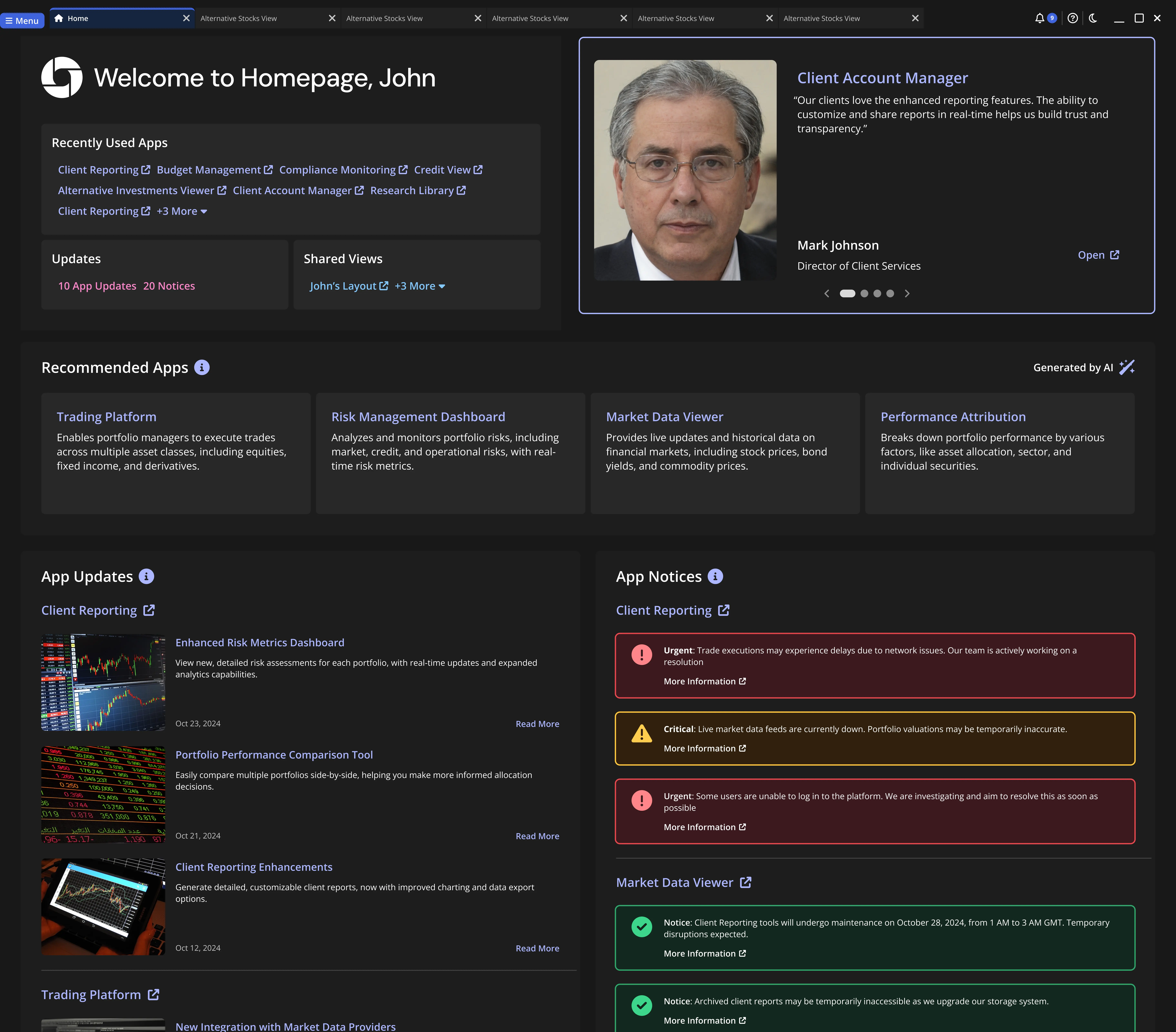
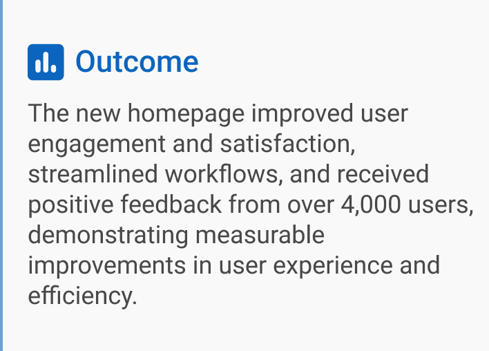
📐 Information Architecture

To zoom out and glimpse a high-level view of the product to provide context and solve workflow problems I created an Information Architecture diagram based on the research:

FigJam was used throughout the project at various stages to create artefacts, such as this Information Architecture diagram. This helps to show what the relationships are between each piece of content, and how content is visibly displayed on the navigation. Good IA is informed by content, context and users. 

🎨 Solution

Through 5 iterative sprints, I moved from sketches to high‑fidelity components in Figma. The redesigned Spectrum Home addresses key user pain points with a range of targeted features:

The actual Spectrum Homepage cannot be posted publicly. This was re-created in Figma and closely resembles the design of the Homepage when viewed on a 1920x1080 resolution monitor.

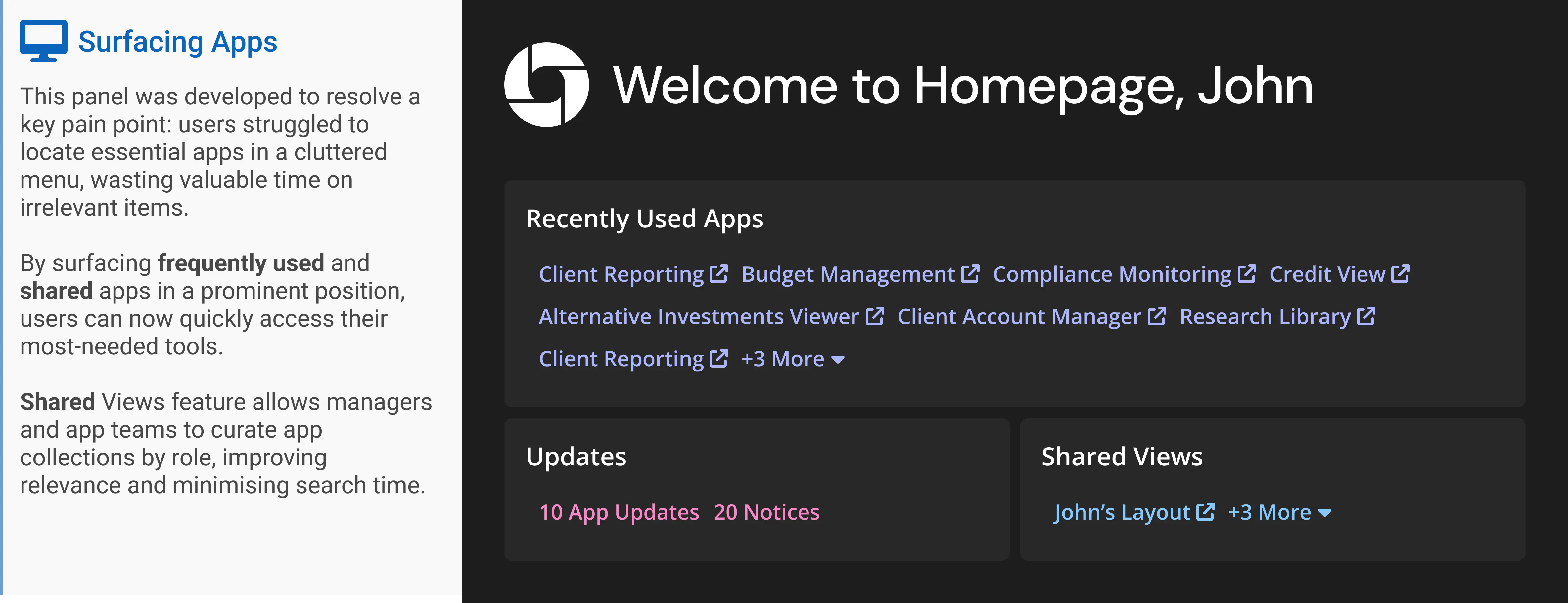
Surfacing Apps: Reduces time spent navigating irrelevant options by providing easy access to frequently used and curated apps.


Announcements: Boosts user confidence and promotes discovery through leadership testimonials about valuable tools.

App Recommendations: An AI-driven algorithm suggests underutilized but relevant apps, fostering exploration.

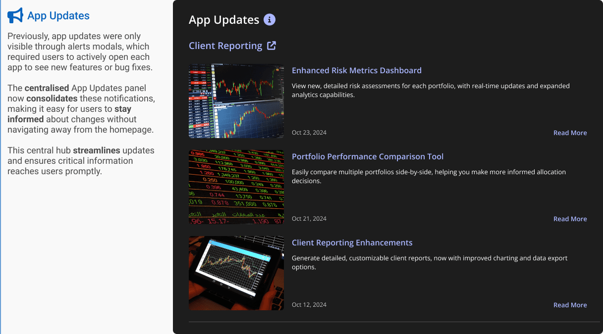
App Updates: Centralizes app changes and updates in one accessible hub, keeping users informed of new features and fixes.

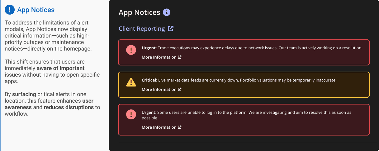
App Notices: Surfaces critical information, such as outages, to alert users without requiring them to open specific apps.

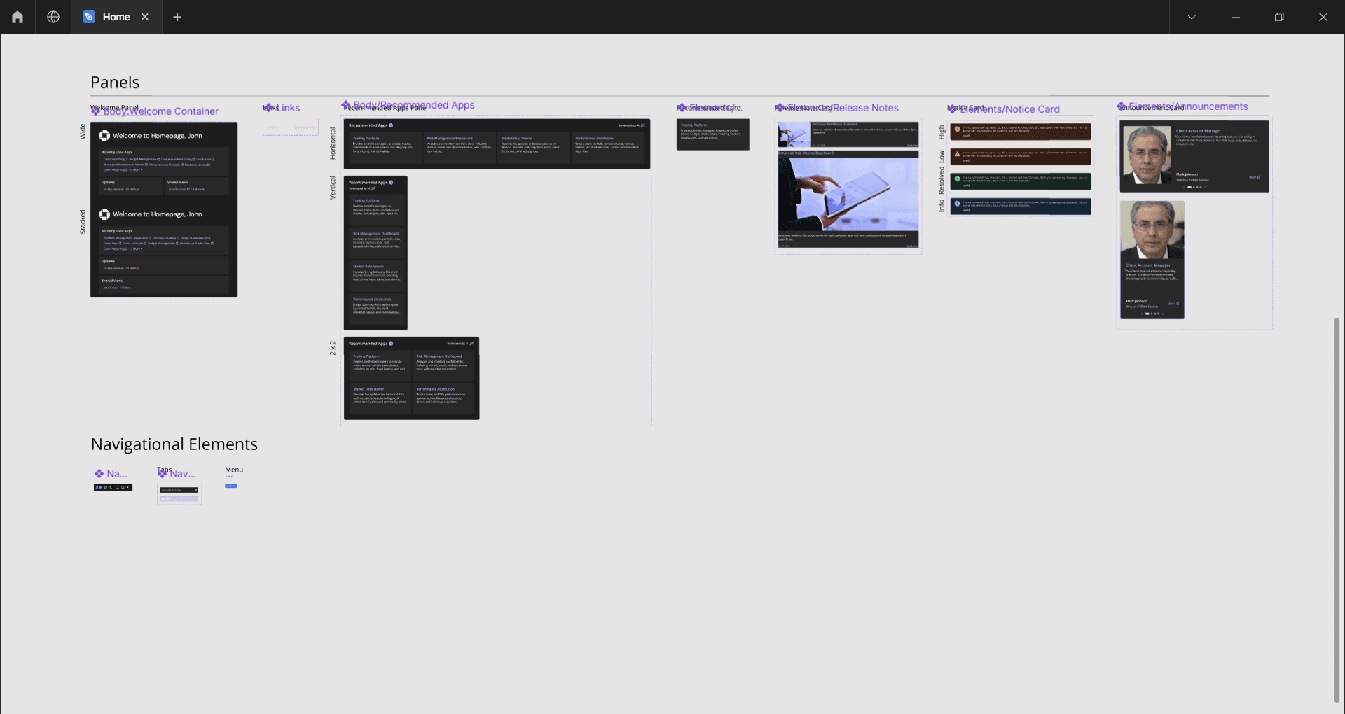
All of this was constructed using a components thus enabling efficient, responsive design. This structure provides flexibility across common breakpoints, offering users an optimal experience on any screen size.

After initial testing with stakeholders, I built high‑fidelity prototypes and refined every interaction and component based on their feedback before engineering hand‑off.

All designs met WCAG 2.2 AA and were implemented as tokenised components in Figma, mirrored in Storybook for engineering parity.

🎯 Usability Testing & Validation

I partnered with a User Researcher to test continuously:

  • 3 moderated rounds (N = 5 each)

  • Maze tests with wireframes (N = 18)

  • Stakeholder beta with 300 users

Results:

  • SUS score improved from 54 → 87

  • Discoverability of hidden tools tripled

  • Users praised the experience as “calmer, clearer, and worth using”

📊 Results

Post-launch analytics showed a significant improvement in user engagement and satisfaction.

Key metrics included:

Higher Engagement: Users are spending more time on the platform and engaging with new apps and features.

Faster Task Completion: Streamlined navigation and personalized content helped users complete tasks more quickly and efficiently.

Positive Stakeholder Feedback: Leadership noted a smoother onboarding process and greater user satisfaction, validating our approach.

The redesigned homepage rolled out to over 4,000 global users. Early feedback was overwhelmingly positive. A post-launch survey showed that 85% of users found the new homepage easier to use, with many commenting on the clarity of navigation and relevance of information.

Quantitatively, we saw a 40% reduction in navigation time for common tasks and an increase in engagement with new tools highlighted via the homepage. Usage analytics showed a notable shift in behaviour, with more employees relying on the homepage as their go-to command centre rather than "bypassing" it.

Beyond the numbers, I’m most proud that the design respected the complexity of the organization while creating something that felt effortless and supportive for users. It brought consistency, focus, and a sense of care to the product’s first impression.

⚡ Leveraging Data to drive UX Decisions

Despite the initial stakeholder push for the Announcements testimonial carousel, Pendo analytics confirmed UX concerns around this feature - user engagement was lower than expected.

Pendo Analytics was set up on the right-arrow button and left-arrow button that advance carousel slides. The data showed usage tapering off over time which was reinforced by user feedback that the carousel did not seem like a useful feature.

Using this data UX is advocating for replacing it with features directly requested in user research such as daily tasks. This shift ensures that homepage better aligns with user needs, improving its utility and relevance.

These findings demonstrate how UX can use data to drive iterative improvements and influence stakeholder decisions.

Pendo Analytics were set up on a particular feature - at first glance the Right Arrow button (that advances the carousel) looked like a great success. However after digging deeper, data showed that usage reduced with time, which aligns with user feedback. (placholder image from Pendo Analytics website used)

🌍 Outcome & Reflection

The redesigned homepage became the default launchpad for over 4,000 global users, reversing the trend of avoidance. For the first time, users described the homepage as "useful" and "essential".

But more than metrics, what mattered most was hearing:

"I actually use this every day now."

Post-launch user feedback.

Want to work with me?

albsouladam@gmail.com

© 2024 Adam Albsoul. Made in Framer.

Want to work with me?

albsouladam@gmail.com

© 2024 Adam Albsoul. Made in Framer.

Want to work with me?

albsouladam@gmail.com

© 2024 Adam Albsoul. Made in Framer.